We've been keeping a secret! For many, many months now, we've been working away behind the scenes, perfecting our brand new colour, Butter.
Now that our newest baby is out in the world (isn't she delicious?!), we thought we'd dish a little more about the process from start to finish. Here's your backstage pass to see how the Mustard magic is made with your tour guide, Becca!
how it starts
We've all been there. You see a piece of furniture online, you dream about it, you save up for it, you create a whole mood board to confirm it will indeed fit with the glorious vision in your mind (just me?!) Then, after patiently waiting (and not-so-patiently checking the tracking daily) it arrives. You rip the box open and… your heart sinks a little. You hope you are wrong, but you know that the thing you have just bought isn't quite what you thought it would be. Maybe it's smaller or bigger than you expected, maybe the finish or feel is different to how you pictured it, or maybe the colour is not how it looked on your screen.
As someone who thinks a lot about my purchases – admittedly often to the point of purchase paralysis – that feeling of disappointment is something that I think about a lot. When it comes to Mustard products, I care so deeply about the experience our customers have, and it's my fear of others feeling that dreaded disappointment that drives so many of the creative decisions that show up all over our website. To stop myself from going down the rabbit hole, there are three C's that I live by. Let's start with the obvious!

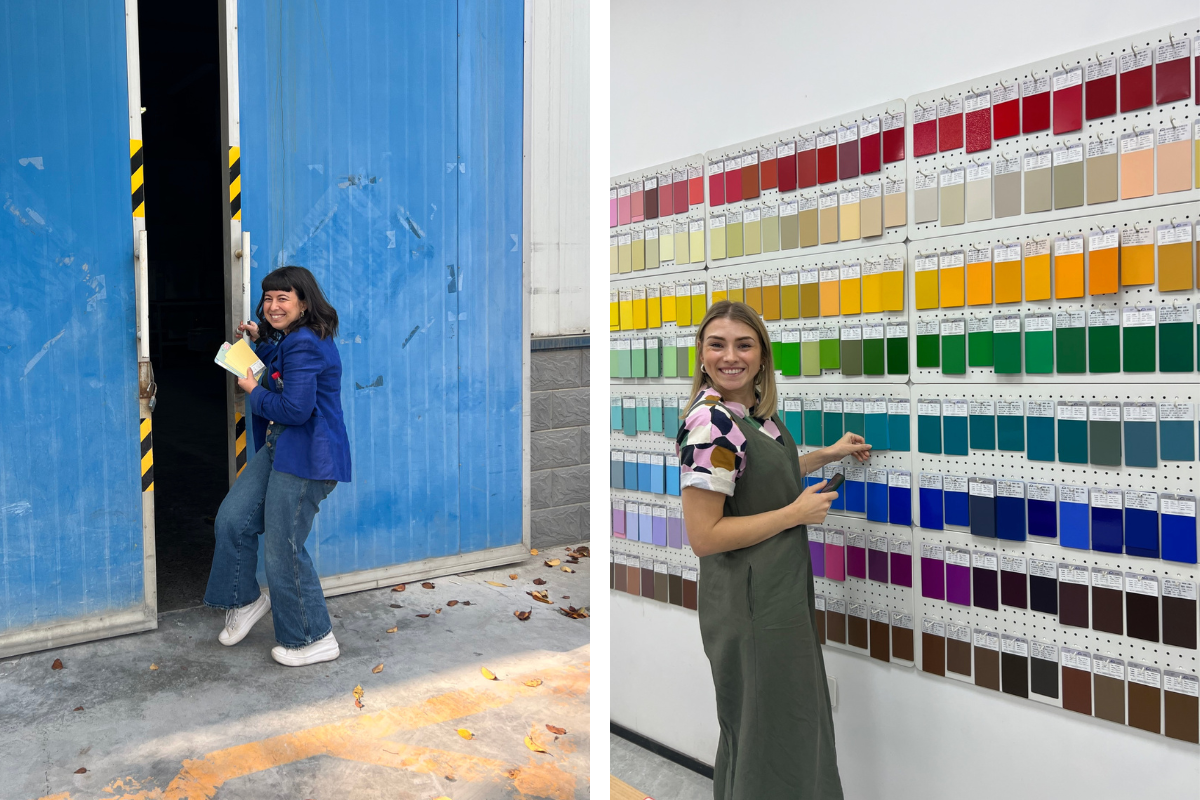
Becca + our product designer Kate on their way to create Butter!
colour
Colour is really the heart of Mustard. We are even named after a colour! So if you don't mind, and hearing the inner workings of a perfectionist's mind interests you, please read on and I'll share how we make sure your unboxing experience is (hopefully!) a highlight.

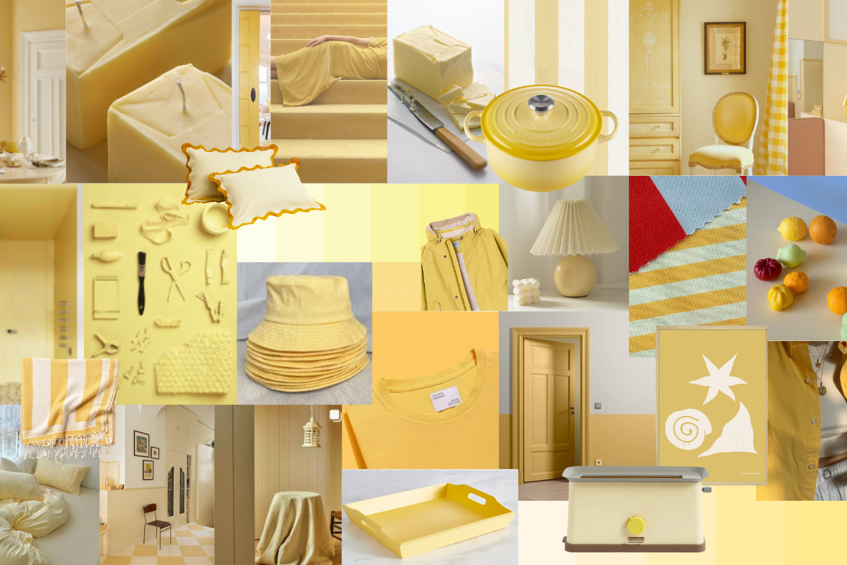
Our Butter mood board, where it all began!
We spend a LONG time selecting the shades we bring into our rainbow. We tend to do this in a very IRL way, with paint swatches, scraps of fabric, ripped pages in magazines and colour reference books. We look for the perfect shade to sink right into our existing range, as if it was always meant to be there. We're aiming for cohesion in the family, while ensuring that a new colour brings something new and unique to the lineup.
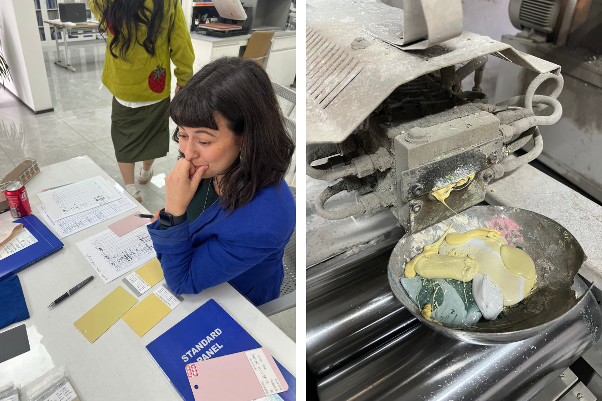
Once we've landed on a final selection of shades (that probably look the same to most people!) we send them to our powder coating factory, who have the most incredible talent for reverse engineering a colour. They quite literally pick out the ingredients for the colour by sight. It's an amazing thing to witness! There is always some back and forth, because sometimes a colour on metal just doesn't sing the way it did on paper, but eventually, we arrive at the final colour.

Perfecting the Butter recipe, it's a nerve-wracking process!
consistency
The next step is to take the physical swatch and create a digital representation of it. For Butter this involved four people squinting at various screens, in various lights, and going a little crazy after way too much tweaking of R and G and B! The digital reference then becomes the baseline for how our products look in photos.
When we do a shoot here at Mustard, we prioritise accurate representation of the colours as we really believe that our customers want to make an informed decision when spending their money with us. So, we avoid harsh light spots on the front, preferring evenly lit surfaces. We steer clear of too much moody lighting that may create a nice vibe, but make Blush look like Peach or Sage look too sad! The photos are all edited to be as close to the digital references as possible, which can be really quite tricky but is totally worth it! Our aim is for the images you see to have consistency. You won't be left wondering if it will look like it does in this image or that one, because they don't look totally different!

Making sure Butter was the perfect fit for the Mustard rainbow
Our dedication to consistency is also the reason we chose to offer colour swatches online. You will always be able to see a colour for yourself, in your home, and match it to the things you already own (or plan to buy!) However, we know that not everyone will choose to get a swatch first so our aim with our website is to give you as much accurate information upfront as we can.
On our product pages you'll see images of the lockers in even studio lighting, on an angle, doors open and shut, and styled in spaces to help you get a sense of the product and how it will function and fit. We also deep dive into the dimensions and share our helpful build-it videos upfront, so there are no surprises along the way. Of course, if you ever do get stuck, the Mustard Team is ridiculously good at solving problems and are trained to know the products inside and out. We're always here to be as helpful as we can be!
courage
There's one more C word that I haven't touched on yet (no, not the rude one!) To me, courage is a guiding light in the design process because as a business owner, there is no shortage of opportunity to get carried away with comparison or led away on a trend train. I try to remember the principles that I really believe in when it comes to our customers having a positive experience with us.
At times it's hard to not give in to the easy option, or stray off-brand. My team know how picky I can be about the smallest details, but to me they truly matter, if you pay attention to the small things, the big stuff takes care of itself. The attention to detail adds up to so much more than the sum of its parts. Colour can be a scary thing but as I grow up, (am I grown up yet!?) I see how good it feels to follow my heart and use colour in ways that make me feel happy. To me, that's courage.
We hope you enjoyed this little insight into the world of Mustard, where we take colour very, very seriously!


Leave a comment